QuicDoc generates reports to help you track trends and assess statistics for your practice or agency, for your patient population, and on the quality of care you provide. The Quality Assessment report calculates the average length of time from the initial call to the first appointment, the number of patients with a breakdown by sex, average age and number of sessions, discharge type and rating, average differential GAF at Intake and discharge, and more. Reports and graphs can only be as accurate and meaningful as the data you enter.
Once you have entered sufficient data in QuicDoc while doing your notes and treatment reports and have entered outcome measures for your clients, you can generate reports and graphs.
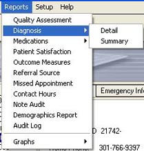
To generate reports, select the type of report from the Reports menu in the main QuicDoc window.
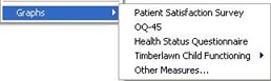
To generate graphs, select the type of graph from the Reports...Graph menu.
Other Graphs
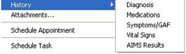
You can graph Symptoms and Impairments and the GAF in the Patient Summary Graph, provided you have entered the data. You can also graph Vital Signs and the AIMS. To generate these graphs, select the type of graph from the Patients...History menu.
See Also